
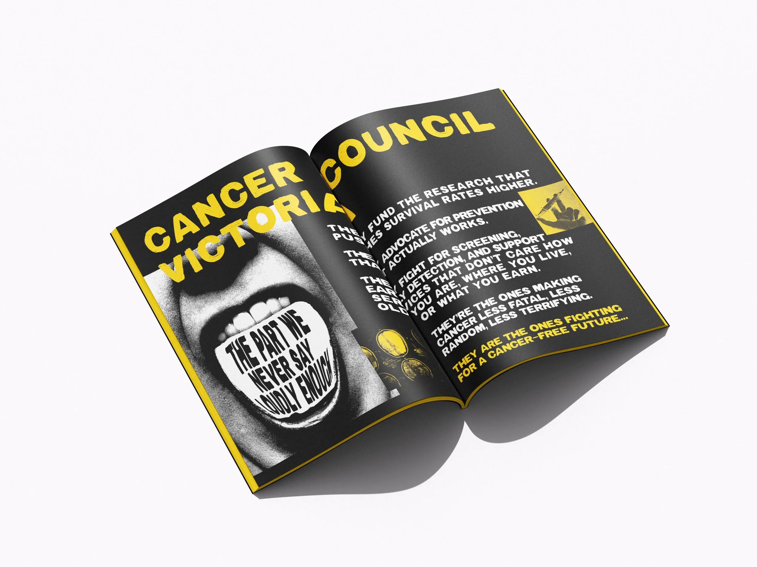
Client: Cancer Council Victoria
Campaign: 1 in 2 Is Too Many - Creative explarations
(OOH + Social + mini zine)
Overview
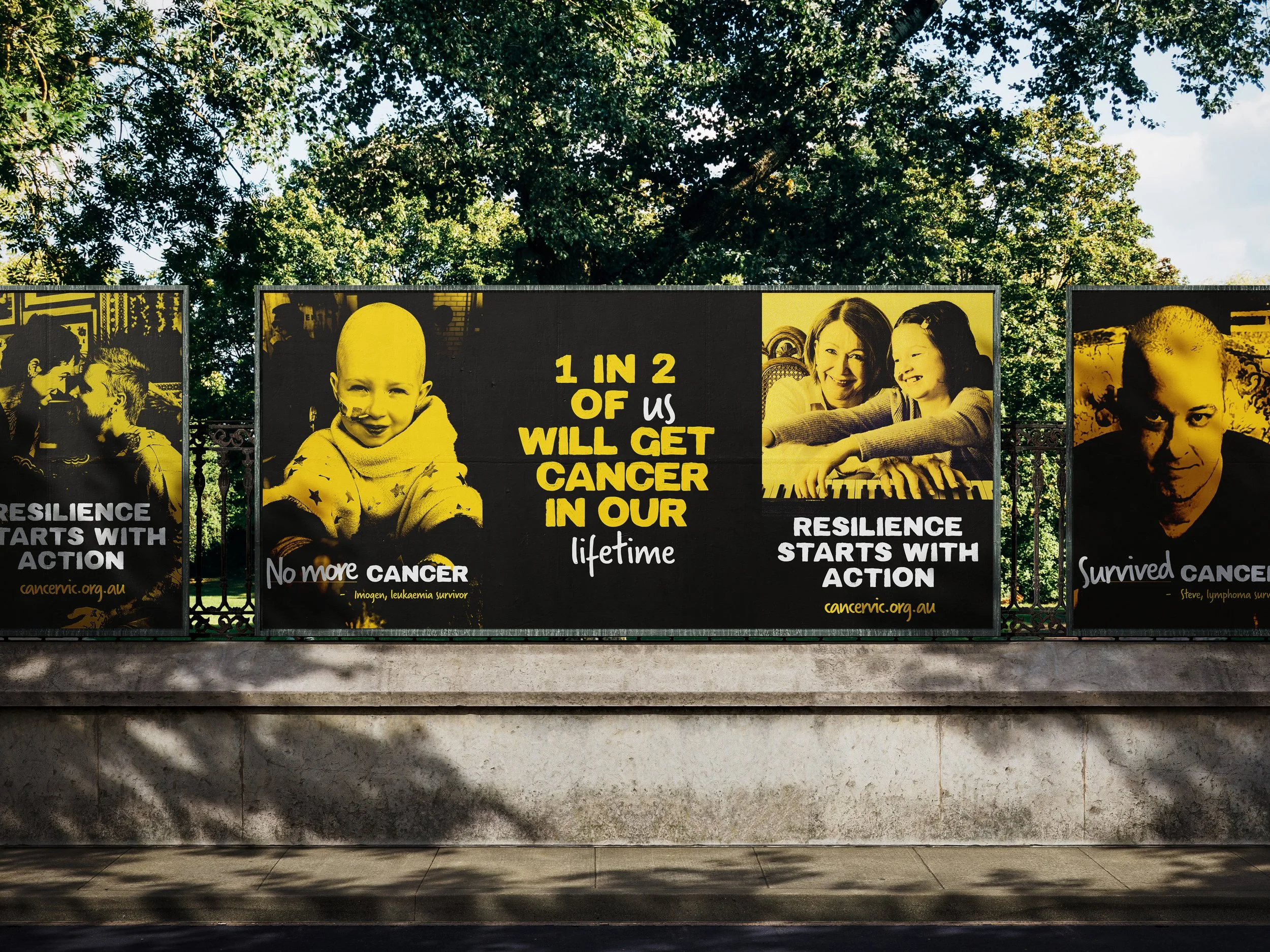
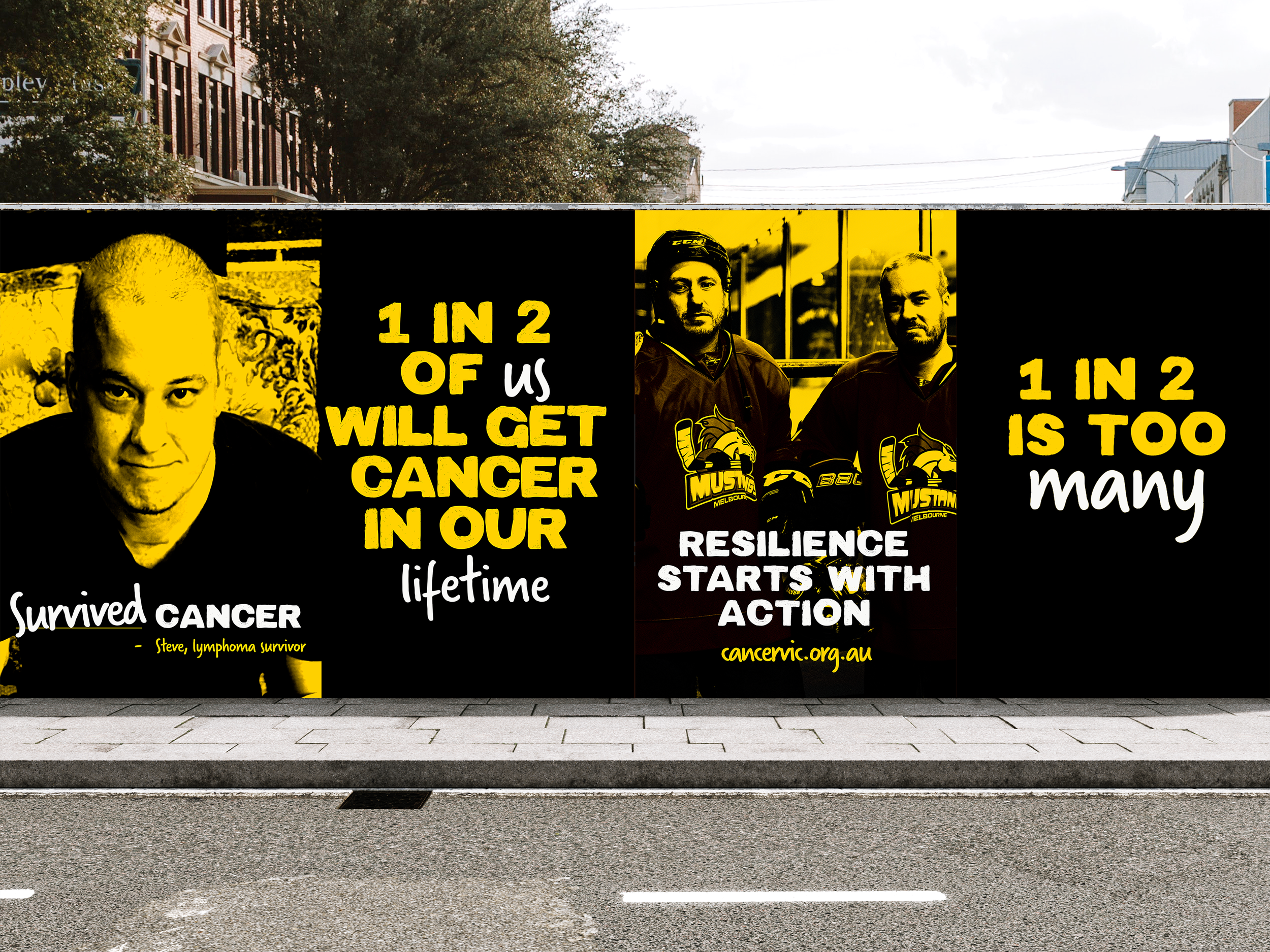
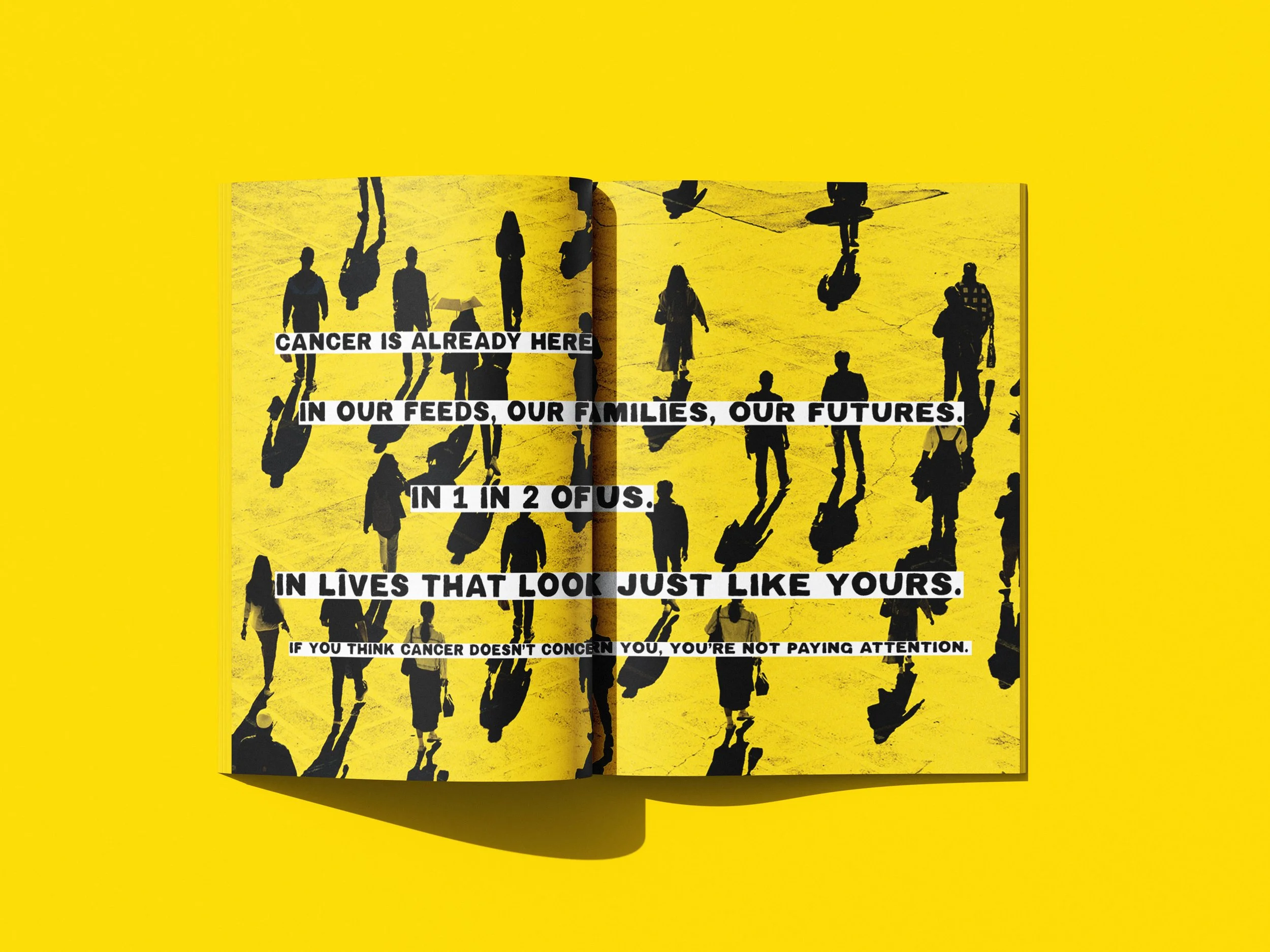
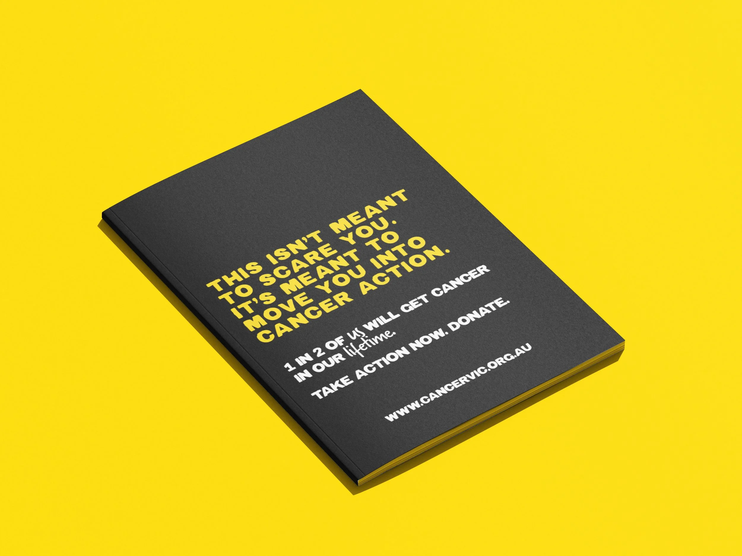
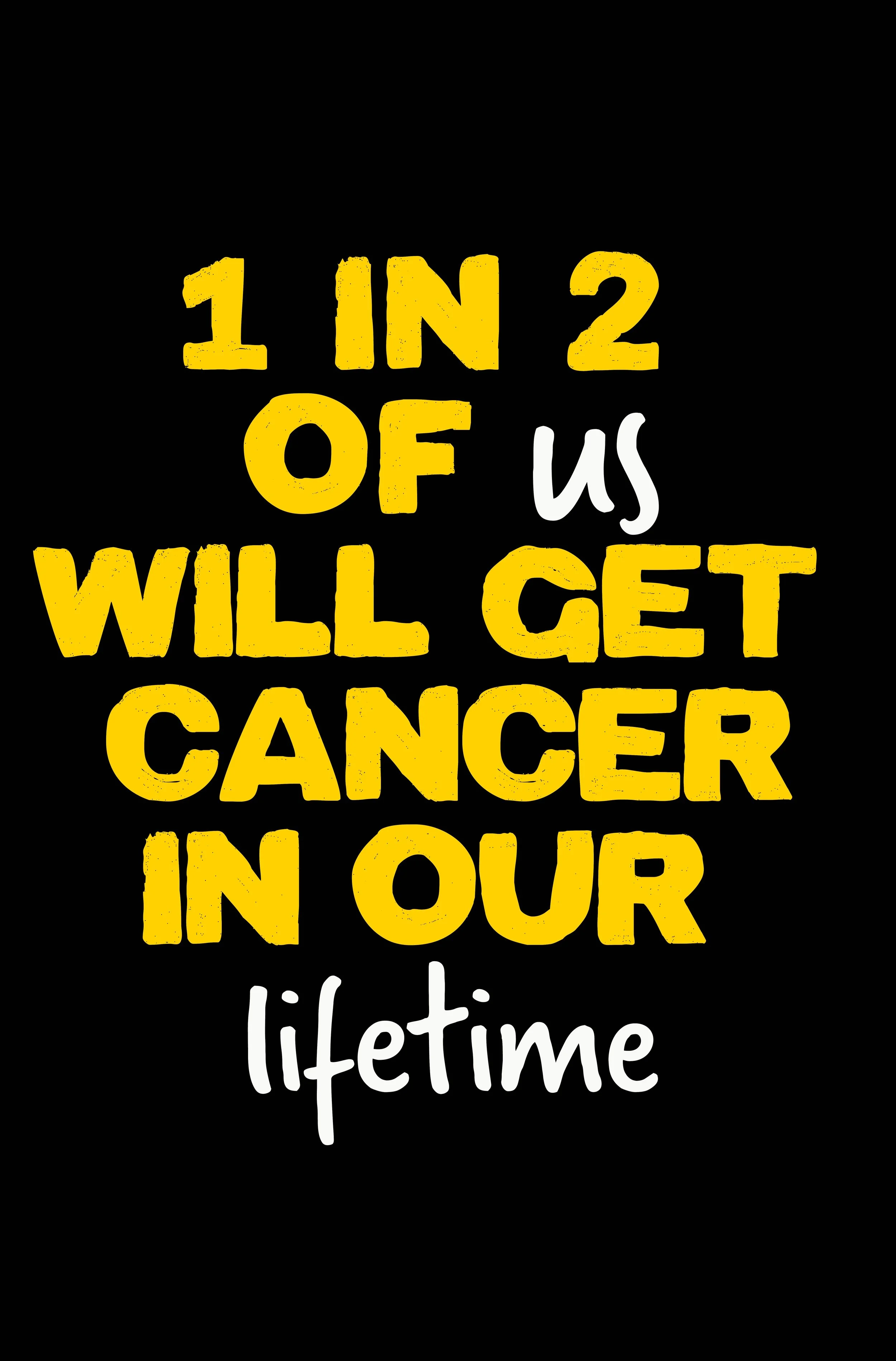
1 in 2 Victorians will be diagnosed with cancer before the age of 85.
This campaign reframes a confronting statistic into something relatable, personal, and human.
Responsibilities
Visual concept development
Art direction
Photography direction
Campaign rollout across print and digital
Approach
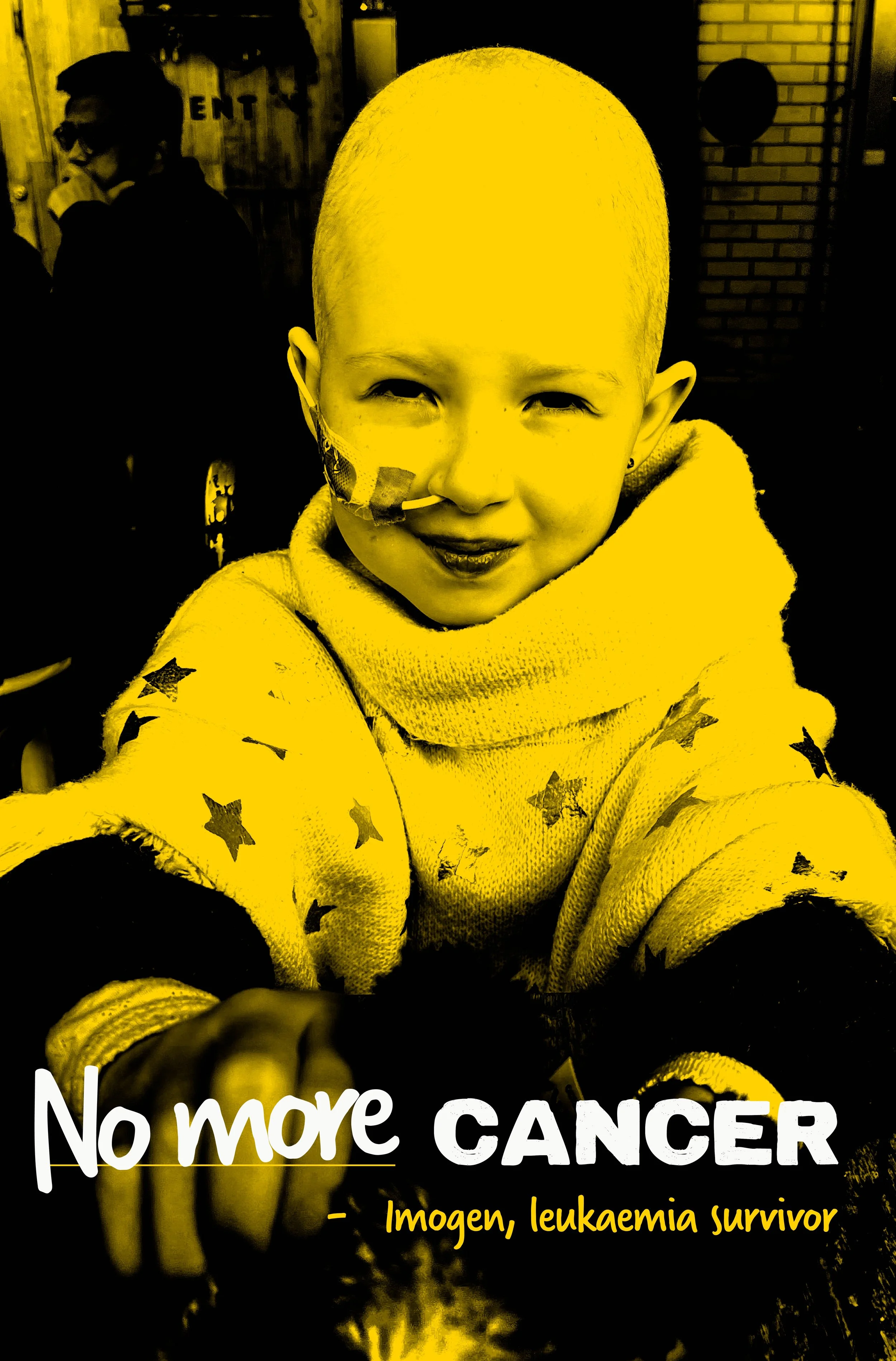
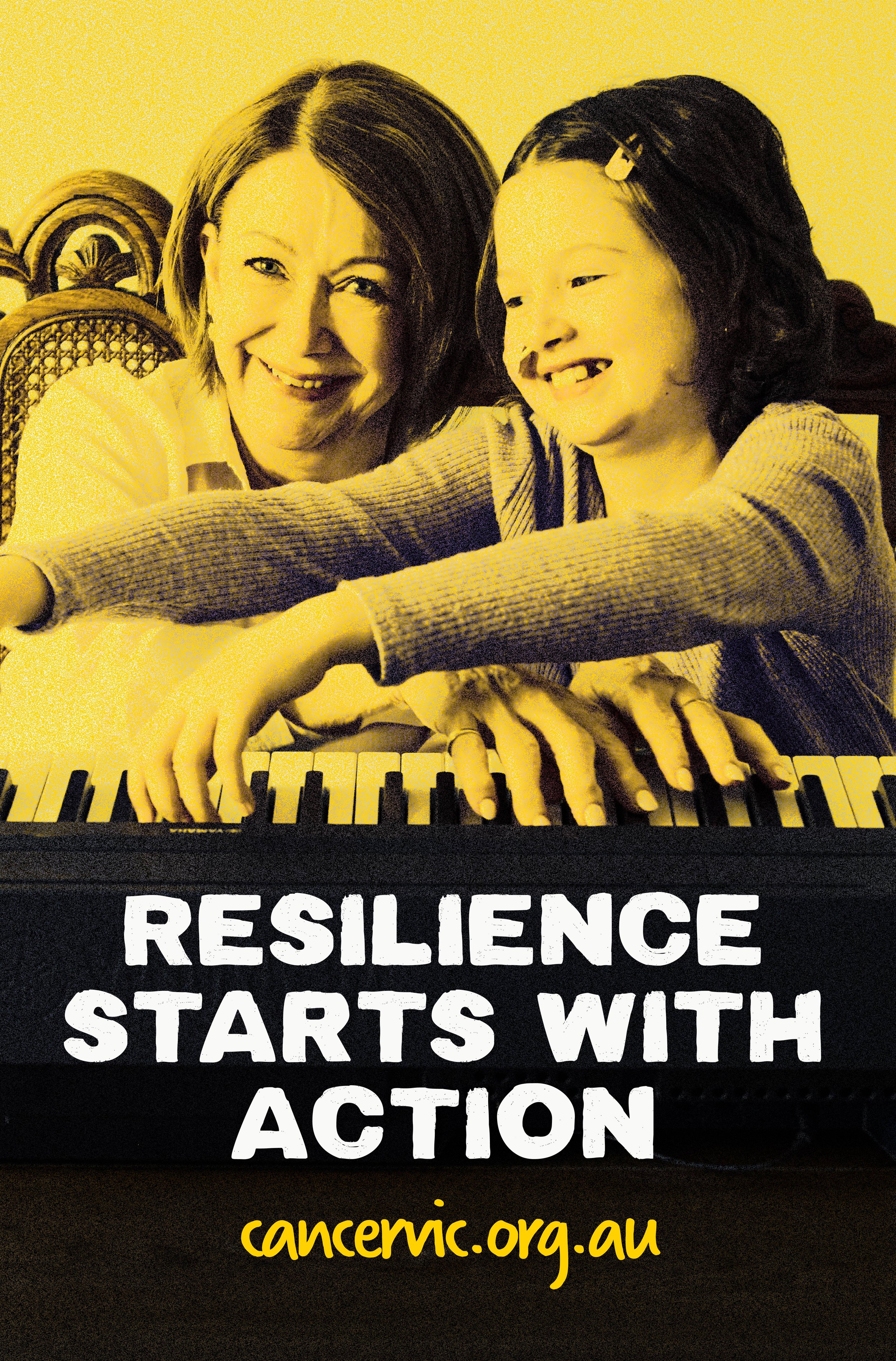
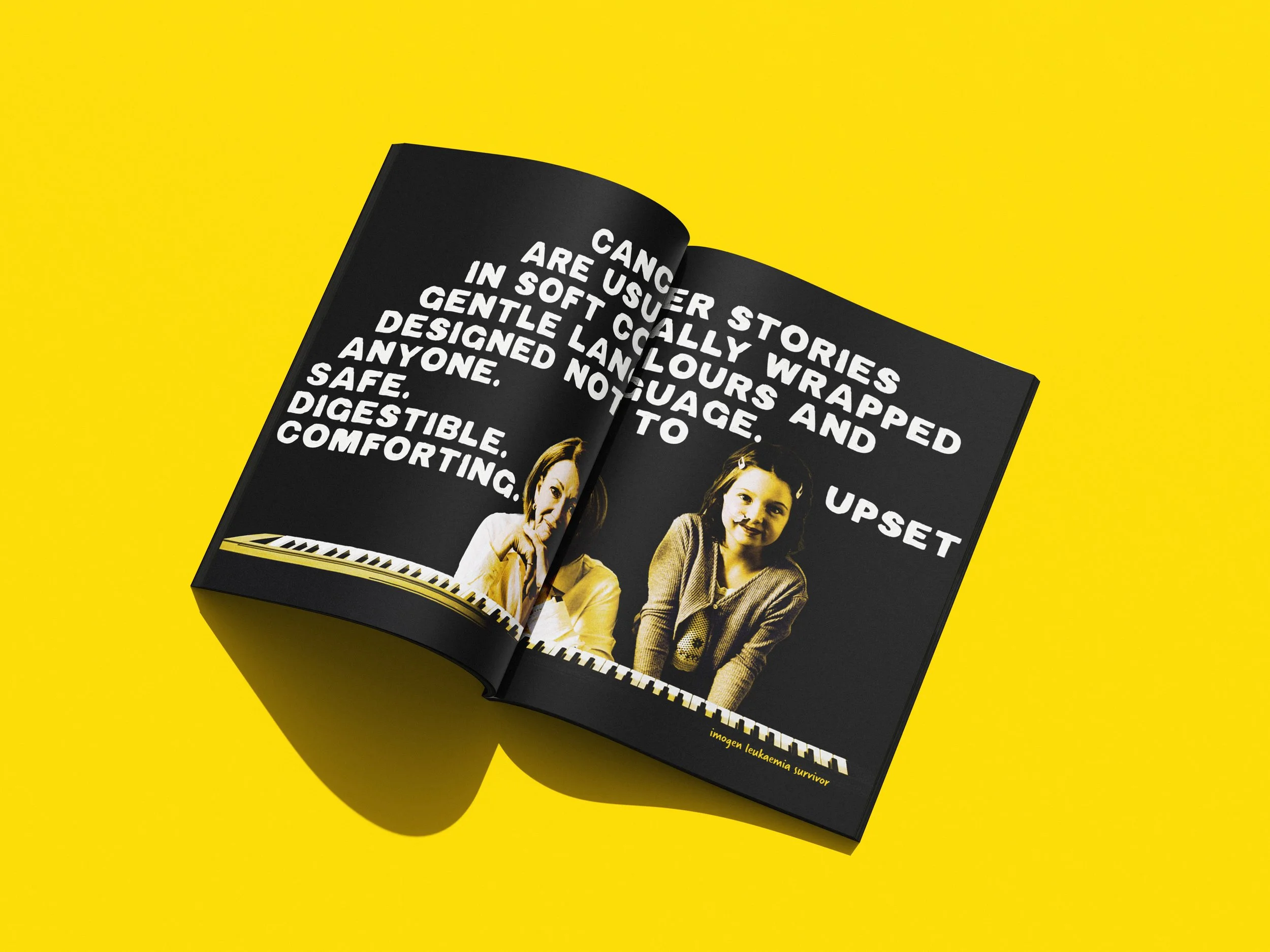
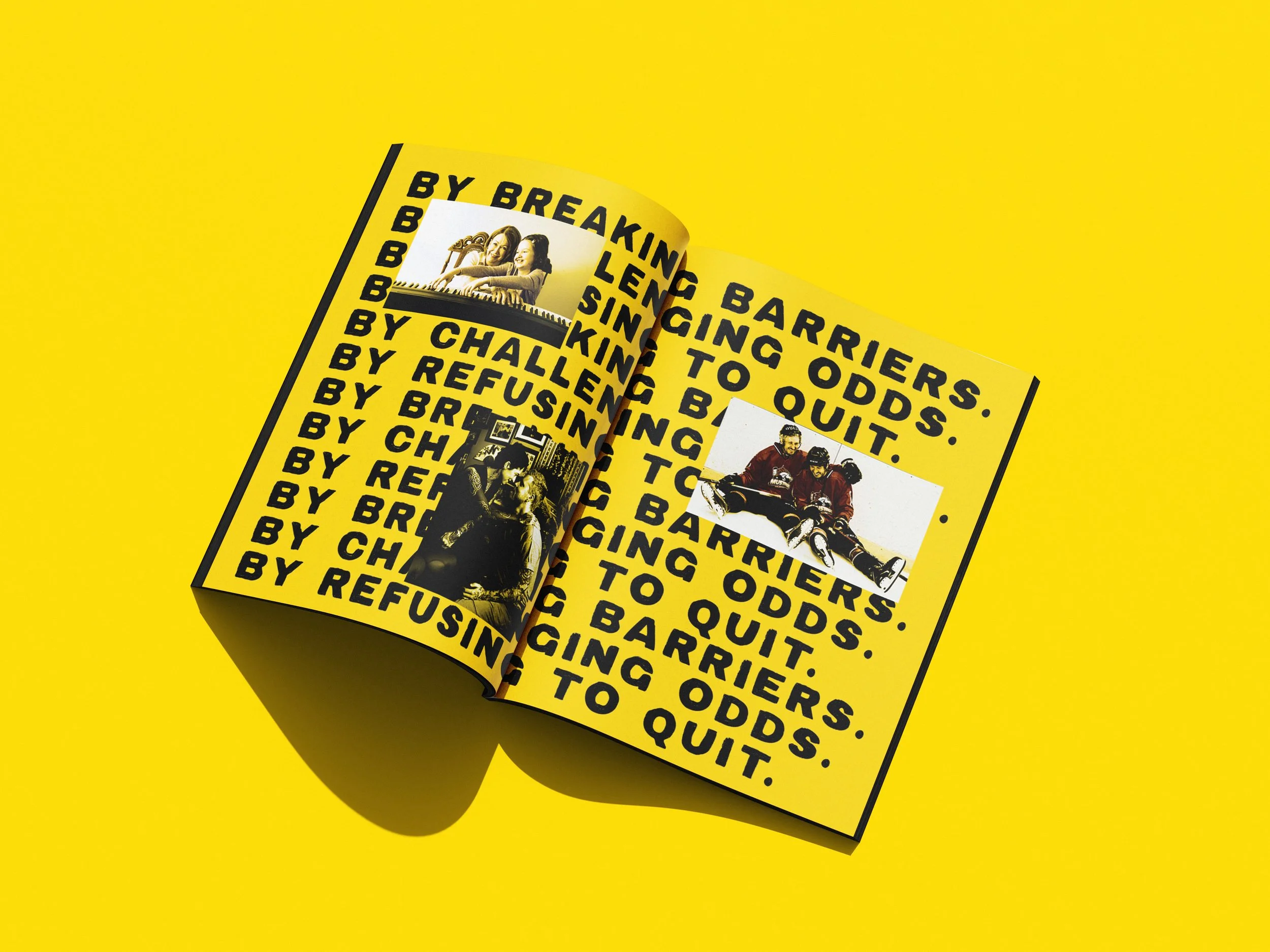
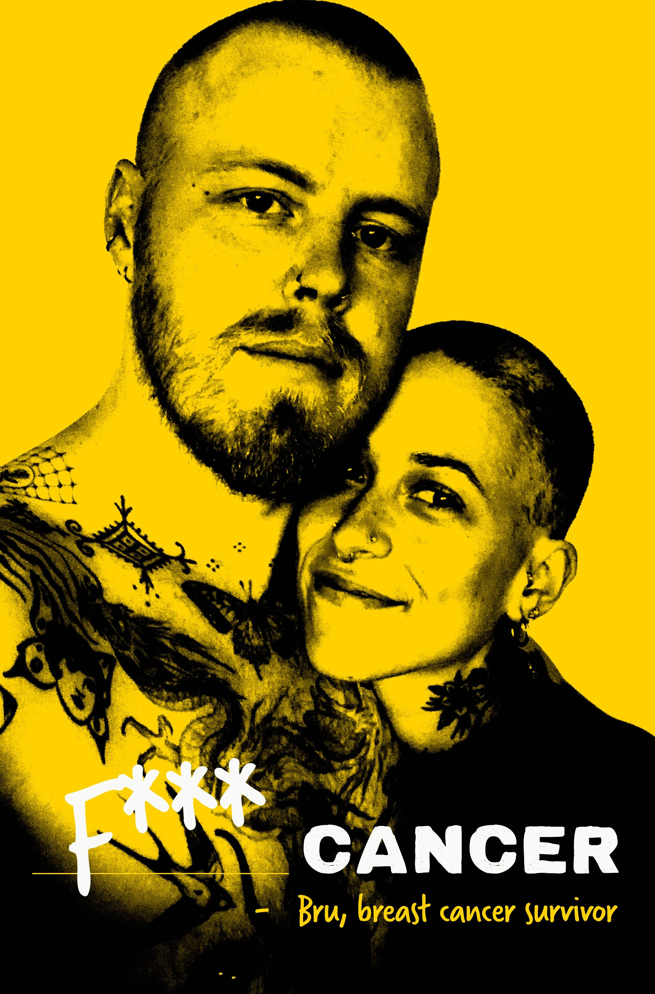
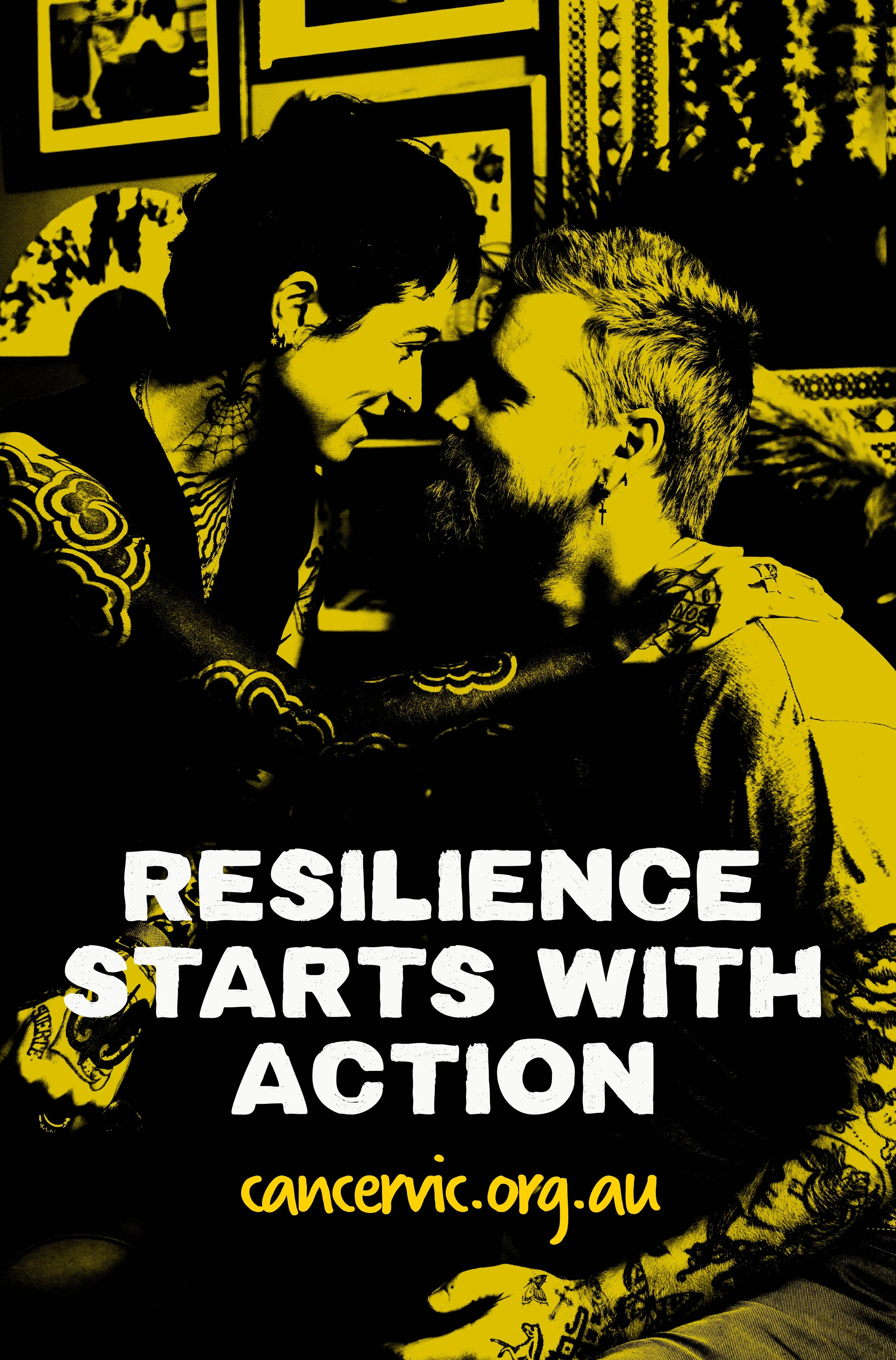
The creative centres on real people and unfiltered moments.
Photography and typography were kept simple and direct to avoid sensationalism and allow stories to speak for themselves.


Design system
Messaging system
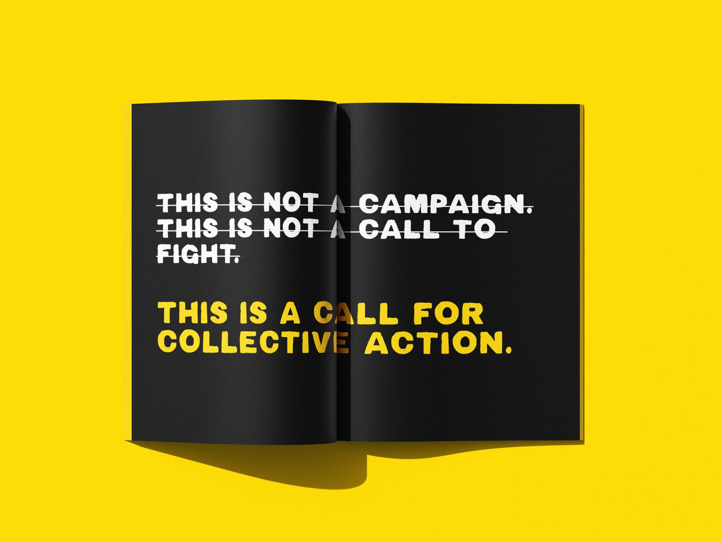
Modular use of the “1 in 2” statistic to create multiple emotional and behavioural entry points.Tone & storytelling
A deliberate range from raw survivor sentiment to clear calls to action.Typography
Bold type for factual authority, handwritten type to convey human voice and lived experience.Scalability
Designed as a flexible system for OOH, social, and digital placements.

The core statements (“1 in 2 Is Too Many”) can adapt to digital formats, but the full narrative performs best in analogue, high-engagement spaces.


Social strategy
Paid assets use motion, color, and contrast to capture attention quickly.
Glitch effects and black-and-yellow contrast mirror the shock of diagnosis and drive audience action.
Organic social strategy
Carousel formats unfold survivor stories, building emotional connection over multiple frames.
Each story links to Cancer Council Victoria’s work, grounding content in real outcomes.
Stories end on hopeful moments to retain attention and build trust.


Explorations & Audience Engagement
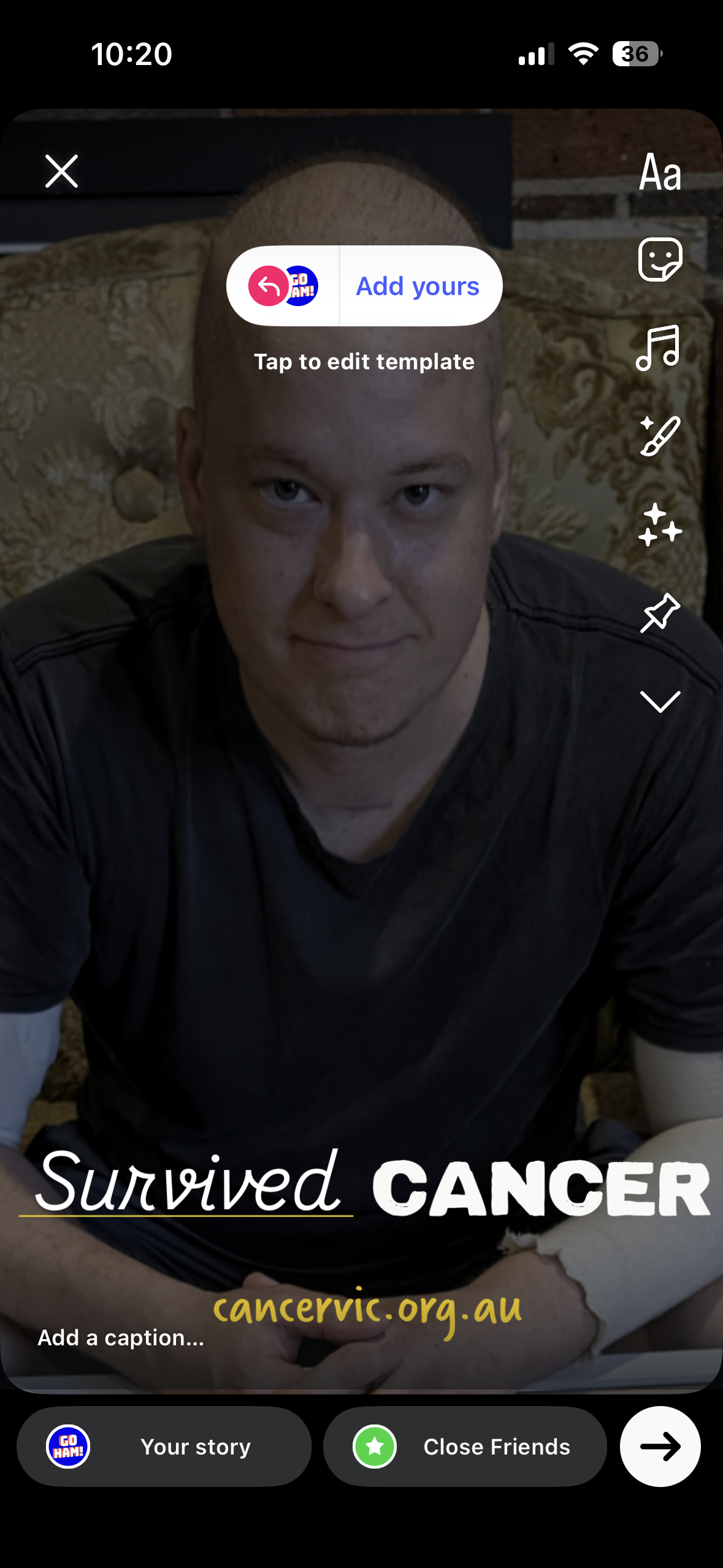
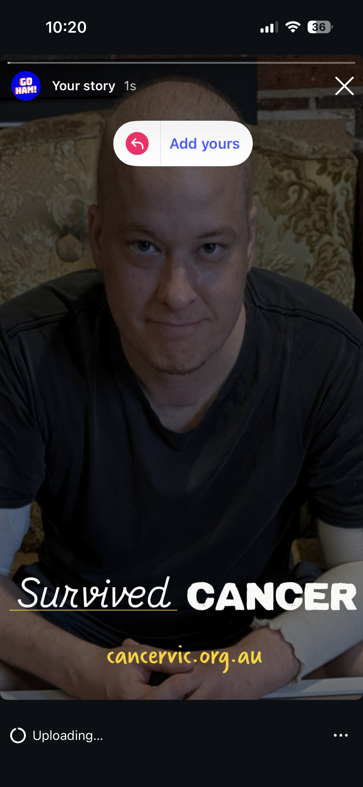
As part of the conceptual development, I designed an interactive Meta template ‘Add yours’ that would encourage people to share their own stories and sentiments about cancer. This approach aimed to make the 1 in 2 statistic visible through real community voices, transforming the campaign into a participatory, collective experience.
Outcome & reflection
While the final campaign direction was more conservative, these explorations represent my approach to public health communication: honest, disruptive and human-led. The work demonstrates how a single insight can be translated across platforms through deliberate, platform-native storytelling that prioritises attention, emotion and action.